


Government public health officials have launched a new website that allows patients to look up how well their GP practice compares with others on measures of diabetes and hypertension care.
Public Health England (PHE) used the launch of the test website, Healthier Lives, to highlight variation in the control of risk factors in people with diabetes, such as blood pressure, blood glucose and cholesterol, and how many people with hypertension are being diagnosed.
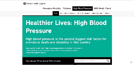
The interactive website, or ‘heat map’, allows users to compare information on quality of care for diabetes and hypertension and their complications by GP practice as well as by CCG and local authority, compared with the average for England.
Health secretary Jeremy Hunt said: ‘This data will help doctors and nurses see at a glance where the problem areas are so improvements can be targeted. This will not only benefit patients but also help to save valuable NHS funds.’
The GPC said the website was broadly acceptable, as unlike practice-level data published on NHS Choices, it also includes demographic information such as age, ethnicity and deprivation.
However Dr Andrew Green, chair of the GPC’s clinical and prescribing subcommitte, said it could go further to show practices with a high proportion of students or homeless people to ensure comparisons were not ‘misleading’.
Dr Green said: ‘This data has been available for some time and most GPs are relaxed about its availability, accepting that patients have a right to see such information about their practices. It is important always to remember that the characteristics of the practice’s population can have a great effect on achievement levels, and so the inclusion of deprivation statistics alongside achievement is to be welcomed.
‘There will always be some practices, perhaps small ones, or ones with atypical populations such as students or the homeless, where these comparisons are misleading, for these practices to be identified on the website would be helpful. However, on the whole I am happy with this work by PHE.’
Dr John Grenville, secretary of Derbyshire LMC, questioned the number of different tools being developed to compare practice-level data and how accurately they reflect practices’ comparative performance.
Dr Grenville said: ‘While I don’t have a real problem with it, I do want to know it reflects accurately what is going on now rather than being a historic shapshot. I suppose the idea is to get practices to look at it and see if there are any areas in which they are outliers.
‘But everybody is trying to do this, producing their own different dashboard. NHS England’s got one, most CCGs are trying to develop one, PHE have now got one. I think there has been a lot of work going on that has overlapped and there are so many tools out their now that people who are looking to compare practices for whatever reason, be they researchers, professionals or patients, will have a plethora of things to look at and if they are different – and there are various reasons why they may differ depending on the quality of the data put into them – how will people know which ones to believe?’


